December 11, 2018 at 8:06 pm (Art Website, Colored Pencil Project, Fanart, Human Portraits)
Tags: Ahsoka fanart, Annie Nelson Artist, Annie's Art Blog, Annies's Art, Ashoka, colored pencil, Fanart, Jedi, Star Wars, star wars fanart
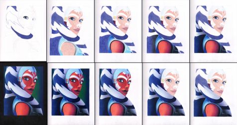
I made some fanart! This is Ahsoka! She’s Anakin Skywalker’s apprentice during the Clone Wars. I’m hoping I can get it autographed eventually – I got a drawing I did of the Supernatural boys signed by both and it makes me happy whenever I see it. I don’t want to post the large image yet so it can’t be stolen before I have the chance to get my original autographed, but here is the progress! I really struggled with her face. At first it was WAY too purple. I had made it purple on purpose like the shadow on her arm (because most of her face is in shadow also,) but instead of a shadow, it just looked like she was two-toned and it was bad. I did not scan her with her purple face, so there’s no image of that included below.
I’m super happy with how her headtails came out! I wasn’t quite sure how it was all going to go. That’s why I did the light layer of color blocking right away to get a better picture of everything (no pun intended.) As soon as I started on the first headtail in images 4/5 of the top row I was super excited about it because they actually look rounded/3D. The whole time I was envisioning doing a green background for her because her original lightsaber is green, but when I was done I decided green wouldn’t look right since her shadows are purple toned – it doesn’t look like she has green light shining on her at all, so I added in the purple to the background edges (it’s purple in real life, but I know it looks blue) and went with a darker green than I planned. I think it came out really well. I also colored the paper black at the end. I plan to get the black part singed at the bottom.
Leave a Comment
June 6, 2012 at 7:54 pm (Animal Art, Art Website, Colored Pencil Project, Dog Art, Shelter Dog Art)
Tags: Annie's Art Blog, Annies's Art, art comissions, art for animals, art for shelter dogs, art website, Artist Annie Nelson, black lab drawing, black lab in colored pencils, black labrador drawing, how to draw with colored pencils, labrador retriever drawing, original art, shelter dog art, shelter dog drawing, simple steps drawing, step by step drawing

 Here we go, an update and explanation for the Bud(dy) drawing. I’ve mostly been using black, but also a lightish blue and a few other colors. All the fur areas have some degree of black in them. As you can see in the mid forhead I have a light layer of black covered with blue and a little brown. On the parts of the body I used
  the same blue, but then also pumpkin orange. Both colors are found in the areas that aren’t solid black. If you look close to the top right of this photo, you can see a little orange underneath the blackm; (by the way, this is just a close-up of the photo above it.) I’d put down the blue/orange to indicate the lighter areas. Then go over
  them lightly with black. The darker areas I would also cover with a light coat of black. The weird thing that happens is that the areas with the blue/orange under the black actually turn darker than the single coat black areas, so then I normally go over the solid black areas again with a second non-solid, but darker black coat. It’s just easier to keep the dark parts darker than the light parts. **Side note, I want to mention I realize there is a size problem with his eyes; it WILL be resolved!**
However, I want to mention it’s pretty important to keep going over it with light coats. Lots of light coats I’ve found are much better than one dark coat. It’s also easier to stop working, then come back to it and blend the two areas together. I always try to leave the edges of an area faded from solid color to a light layer if I need to continue that chunk of picture. Otherwise, as you can see, I tend to finish one area at a time, start to finish, and then start a new area. I know a lot of talented pencil artists do light layers over the whole thing, I’ve tried that and I just can’t do it. I feel like I’m not getting anything done.
Please check out my website here for more info! Or here for prints! And check out previous posts here and here for more info on this drawing and my plan. =)
Thank you!
Leave a Comment


