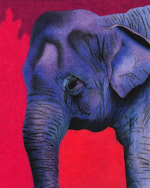
This is an elephant I drew using a free stock photo I found online as a reference. It was totally free of any rights and it was close-up, which is VERY difficult to come by. My scanner doesn’t scan things 100% accurately, so in real life, the two pinks are more different from each other and overall, it looks better, but I am still happy with how this came out. It was an experimental piece. I originally wanted to draw a baby elephant, but since I ended up using a photo of an older one, I decided my goal was to make her look beautiful.
I used blue and purple because those are my favorite colors. I really just started by putting down a little blue here, a little purple there and adding in some black, then more blue, then more purple. I wasn’t sure what to do with the background but I wanted something that popped, so I went with the pinks and purple to represent sort of a sunset, but also just because I like those colors. I want to draw a whole set of different endangered species and then post the images on fineartamerica.com. I have this elephant and my previous wolf drawing so far. My wolf drawing sold a print a month ago (yay!) so I used some of the profit to purchase myself a decal from Howling for Wolves for my car. They are sold as a way to raise funds and also by putting the decal on the car it also raises awareness. This drawing would benefit the David Sheldrick Wildlife Trust. They pay for the raising of orphaned baby elephants and some rhinos. They spend years caring for them and eventually the elephants are able to slowly adapt back to living in the wild. It’s beautiful. Next on the list is a manatee. Trouble is making time to do all of this. I still have 3 or maybe 4 commissions to work on first.
Back to my elephant drawing. I think I might Photoshop the background black and sell prints that way too. I like the idea of the elephant against the black background, but I didn’t want to make the background black with my colored pencils because solid colors never come out solidly. I should mention that I always use a circular motion technique for backgrounds, that way they don’t show a directional pattern. It also makes it look like the color is not solid intentionally. This is sort of visible in the top purple portion below.
I think that’s all I have to say on this one. Please check out my personal website or Etsy page for a gallery of other art, or my FineArtAmerica page if you are interested in this print specifically!


 One more thing I want to mention is that I used my Gelly Roll to sign the drawing. I really prefer using pen. It’s so much easier, it looks like my real signature instead of a forced version. So, Gelly Roll it is from now on! Feel free to check out
