Golden Retriever Portrait

This is my Golden Retriever girl! She’s part of my shelter dog series. I took her photo while volunteering at my local shelter (adopt don’t shop!) I’m hoping eventually I’ll sell some prints of the dogs in this series (available at www.artpal.com/AnniesCPArt ) and then I am going to donate a portion of the proceeds to help shelter dogs. I’m drawing all purebred dogs that come through the shelter in an effort to make people aware that they don’t need to buy from breeders to get the breed that they want.

I wish I had made her snout lighter like the light part of her belly. I did her face first and had a different vision of where I wanted to go. I didn’t want to erase because it always causes problems, so I left it. I’m still pretty happy with her though. I decided to go with a wintery themed background partially because I wanted to bring out the blue in her eyes. It also contrasts so well with her orange fur. And it is winter after all.

Here’s the progress image because I just really like compiling these.


And then here is a split image I made of her photograph and the drawing. You can see that her face was a bit lighter than I made it! I’m glad I made her eye area more orange, I just wish the snout had been a little brighter. Oh well. She’s such a happy girl. She wasn’t at the shelter long.


Ahsoka!

I made some fanart! This is Ahsoka! She’s Anakin Skywalker’s apprentice during the Clone Wars. I’m hoping I can get it autographed eventually – I got a drawing I did of the Supernatural boys signed by both and it makes me happy whenever I see it. I don’t want to post the large image yet so it can’t be stolen before I have the chance to get my original autographed, but here is the progress! I really struggled with her face. At first it was WAY too purple. I had made it purple on purpose like the shadow on her arm (because most of her face is in shadow also,) but instead of a shadow, it just looked like she was two-toned and it was bad. I did not scan her with her purple face, so there’s no image of that included below.

I’m super happy with how her headtails came out! I wasn’t quite sure how it was all going to go. That’s why I did the light layer of color blocking right away to get a better picture of everything (no pun intended.) As soon as I started on the first headtail in images 4/5 of the top row I was super excited about it because they actually look rounded/3D. The whole time I was envisioning doing a green background for her because her original lightsaber is green, but when I was done I decided green wouldn’t look right since her shadows are purple toned – it doesn’t look like she has green light shining on her at all, so I added in the purple to the background edges (it’s purple in real life, but I know it looks blue) and went with a darker green than I planned. I think it came out really well. I also colored the paper black at the end. I plan to get the black part singed at the bottom.

Ahsoka Collage

American Eskimo Dog

Earlier this year I completed my first drawing ever on black paper! I’ve been wanting to do one of these for a long time! I always struggle to draw white dogs and I thought maybe it would be easier on black paper.  It was a really interesting process, but definitely had it’s ups and downs. I really struggled with the eyes since the outline of the eyes was in black on the black paper. I didn’t quite have the shape right at first. My other big struggle was that the pencil wasn’t covering as solidly on the black paper as it does on my usual Bristol paper. In my images below I had to brighten the contrast a bit, unfortunately in real life the white is not quite so bright. I took a long break while working on this drawing and bought some pastel pencils and a piece of pastel paper to start over. However, I didn’t really like how that one was coming out either, so after a month or so I ended up coming back to this drawing.

Eskimo Dog Collage

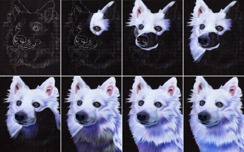
One thing I did really enjoy was how nicely the white covered darker colors. Part of that was because I invested in the Caran d’Ache white pencil; expensive, but completely worth the cost. I’ve seen other artists mention that it’s the best white pencil they have as well, which is admittedly why I decided to give it a try. I used a looser style with this which was also kind of nice. Instead of my usual 25 hours for an 8 x 10 drawing I think the whole thing only took about 18 hours or so.

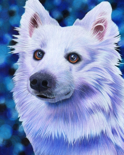
I really love the soft pastel blended backgrounds, but they are MESSY and also some of them are not so good to be breathing in. Given that I’ve already inhaled over a lifetime’s share of sanded drywall filler stuff (my basement flooded and it was a total disaster) I don’t want to breathe in anything that I don’t really need to. Anyway, since the pencils took to this paper differently they blended a bit more than normal and I think I still achieved a pastel-ish kind of look. I kept it with the color theme after some debate. I almost went for the contrast, but I’m glad I didn’t. I really love these colors.

Eskimo Dog 10 Contrast

Here’s a comparison of my photoshopped version to a version that more closely matches the real life drawing. As you can see the drawing on the right is a little darker. Not necessarily bad, it just isn’t what I was going for. Since my main goal was experimentation and to possibly sell prints, I’m not concerned about enhancing the contrast. If I were to sell the original, I would obviously present my lesser photoshopped version or let the person see it in real life. One day I hope to do an art show with all the drawings in my shelter dog series. I have done 7 now I believe, but one I am not satisfied with. I’ll either have to re-do that one at some point or create a substitute. That particular drawing is of a Lab and my reference photo was a little blurred because the little bugger kept moving – typical Lab! Final Version Comparison

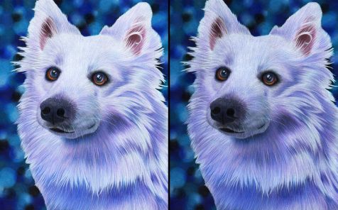
I’m going to try to get this up to date by the end of the year. We’ll see.

Cheers! (Where everybody knows your name.)