September 15, 2017 at 9:36 pm (Animal Art, Art Website, Dog Art, Shelter Dog Art)
Tags: animal art, Annie Nelson, Annie Nelson Artist, Annie's Art, Annie's Art Blog, art commissions, Brittany Spaniel art, Brittany Spaniel colorful, Brittany Spaniel drawing, colored pencil dog, colored pencil drawing, colored pencil techniques, original art, personalized pet art, personalized pet portrait, pet portrait, shelter dog art, shelter dog drawing
I was intending to work on the background tonight, but I found myself completely unable to decide on a color. I scribbled test swatches on scratch paper, but still couldn’t decide. Usually I make pretty swift decisions about which background colors will look good. I’ve been leaning toward a green to tie in the small amount of green in the eyes, but I wasn’t set on it. Finally I decided to go into Photoshop and try out some colors. Here are some of the better trials…
1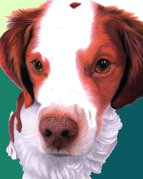
2
3
4
5
I also debated whether I should go more monochromatic and use the blues/purples that are more prominent. I think my favorite is number 2 with the more muted greens and the darker blue-grey on top. I normally put the darker colors on the bottom, and I usually use brighter colors, but as I filled in color after color the muted greens just seemed to go the best with the rest of the drawing. I think it is more important to use the color that will look the best rather than try to stick to an idea of absolutely needing to use bright colors to stay within my style.
Another thing I have also been debating is whether or not to use a texture. I was originally planning to give the background a different texture, but there isn’t a lot of background in this one and I have a lot of fluffy hairs I’m going to have to draw around on the top. Adding in a texture could be more complex than what I’m really looking to do, but we will see…
Leave a Comment
September 13, 2017 at 9:52 pm (Animal Art, Colored Pencil Project, Dog Art, Shelter Dog Art)
Tags: Annie Nelson, Annie Nelson Artist, Annie's Art, Annie's Art Blog, Brittany dog art, Brittany Spaniel, Brittany Spaniel art, Brittany Spaniel drawing, colored pencil white fur, colorful Brittany Spaniel, dog art, dog drawing, how to draw with colored pencils, layering colored pencils, original art, personalized pet art, personalized pet portrait, pet portrait, shelter dog art, shelter dog drawing, vibrant dog art
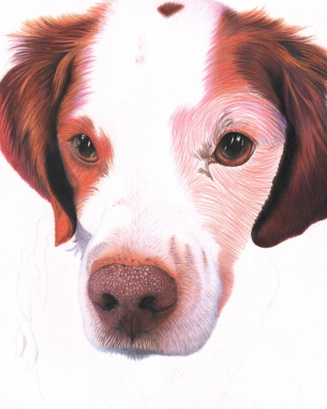
I am DONE with school and I’ve been working on a Brittany Spaniel! This Brittany was at the shelter I volunteer at earlier this year and was just a total doll. I loved this dog. The drawing is a part of my purebred dogs at the shelter series which I’m doing in an effort to bring awareness to the issue and also to hopefully generate some print sales.
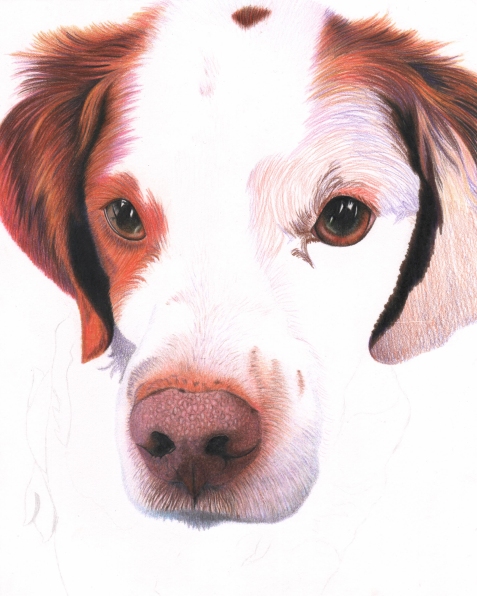
At first I was super excited about this drawing, but I really struggled with the body portion and have lost a little enthusiasm. The body is white, but half is in shadow so I was planning to make the shadow area “grey.” However, I messed up the portion that was supposed to be lighter and had to cover it with darker pencil marks, so the whole body came out looking a bit grey. Sigh. One day I will learn to draw a white dog properly. Anyway, without further ado, here is the progress of my drawing. The images that are darker are from my camera and the ones with the bright white background are scans. Also I made the contrast on some of the scans higher to make it more close to reality whereas I didn’t on some of the other scans. I tried to take more photos and scans than I normally do to really show the progress of the drawing and the layers for anyone interested.




Leave a Comment
June 10, 2017 at 4:08 pm (Animal Art, Colored Pencil Project, Dog Art, Shelter Dog Art)
Tags: animal art, Annie Nelson, Annie Nelson Artist, Annie's Art, Annie's Art Blog, art for animals, art for dogs, colored pencil dog, colored pencil drawing, colorful dog art, custom pet art, custom pet portrait, dog art, dog drawing, labrador art, labrador drawing, original art, personalized pet art, personalized pet portrait, pet portrait, shelter dog art, shelter dog drawing, vibrant dog art, yellow lab
Another short blog in an effort to get my website all caught up. This is Buster the Labrador. I drew him last spring and summer. It was very spread out over the course of several months because I was a full-time student and working 30 hours a week at that point too. I decided to do this drawing instead of a Poodle I had sketched because I thought it would be faster and easier. While I’m sure it was definitely faster (curly Poodle hair is difficult!) I really struggled with the coloration of his face. I never could pinpoint why. Maybe because my original photo was a bit blurred? In any case, I am okay with how it came out, but it is definitely my least favorite in my series of purebred dogs so far.
I may or may not have explained in my previous posts that I am attempting to create a series of drawings of purebred dogs for several reasons. First, I am (so far) using only photos of dogs I walk while volunteering at the Animal Humane Society in Minnesota. I want to bring attention to the fact that there are purebred dogs in the shelter all of the time. Secondly is because I want to raise money to be able to donate to rescues and based on the commissions I have received, I believe that prints of purebreds will sell better than prints of mixed-breed dogs. Although I have only ever owned mixed-breed dogs myself, there are purebreds that I love and I can identify with wanting prints of purebreds, so I’m compensating my promotion of purebreds by attempting to raise awareness and giving back to rescues essentially.
With all that said, here is my progression of Buster.

I used layers of peaches and oranges, light yellows, and even lavender. I believe there is a bit of brown in there too. I wanted to keep the background colors in the same color scheme, but I wish I would have switched something up a bit. Like I said, this is my least favorite of the series. Maybe I’ll have to do a Chocolate or Black Lab in the future. 🙂

While I was writing the above, I decided it would be cool to create a collage of the series so far for anyone who is looking at this post only and not my others. Right now I’ve got a Basset Hound, Chihuahua, and Labrador. Although I haven’t done any art whatsoever since last October because of school, I will be down to a half-time student from full-time in 3 weeks and I fully plan so start doing art immediately. 
Leave a Comment
April 2, 2017 at 8:56 pm (Animal Art, Art Website, Colored Pencil Project, Dog Art, Shelter Dog Art)
Tags: Annie Nelson, Annie Nelson Artist, Annie's Art, Annie's Art Blog, Chihuahua drawing, chihuahua painting, colorful chihuahua, colorful dog, custom pet art, dog art, personalized pet portrait, pet portrait, vibrant animal art, vibrant chihuahua
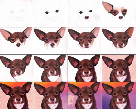
Hi everyone! I’m back! I have not completely forgotten about my art, but I’ve been in school earning an accounting degree and it has been very time consuming. First, I want to say that my previously posted drawing, Daisy the Basset, made it into the Minnesota State Fair last year (2016!) It was my first year making it in and it was super exciting. I have another entry set to go for this year. It’s a wolf drawing. I will post about him later. Hopefully I will find time to write some posts in these upcoming weeks, but I will be down to one remaining class in July so at that point I will for sure have time to update this site. Anyway, this the drawing I worked on after Daisy the Basset. He is Johnny the Chihuahua. This is from February-ish of 2016, so over a year ago. I am really happy with how he turned out. I wanted to use bright colors in the background and I think it fits really well with his coloring and also with gives it a fiesta kind of feel. I still remember him at the shelter. He was very shy, but was with a friend. I’m sure they are happy in the home they found.
As with Daisy, Johnny is an 8 x 10 drawing. They’re part of a series showcasing purebred dogs at the shelter. I’ve collected a lot of photos of purebred dogs, just need to get time to draw them! AND start taking commissions again. I’m getting excited to get back to my art. It’s been a long time coming. Here’s Johnny!!

I used circular motions for the background. I think it shows up a little bit. Lots of layers of colors. Looking at this again, I’m really happy with the eyes especially. I remember working on it and being concerned that they were going to look strange because they were different from the regular pattern of highlights and whatnot that I use. It’s really nice to be using photos I’ve taken myself so I can make sure I have the quality I need. So much of the quality of the drawing depends on the quality of the photos.

Peace everyone. Hopefully I will be back soon!
1 Comment
November 14, 2015 at 10:00 pm (Animal Art, Art Website, Colored Pencil Project, Dog Art, How to...)
Tags: animal art, Annie Nelson, Annie Nelson Artist, Annie's Art, Annie's Art Blog, boxer art, boxer drawing, colored pencil, Colored pencil pet portrait, colorful dog art, dog art, dog drawing, personalized pet portrait, pet portrait, vibrant animal art, white shepherd art, white shepherd drawing
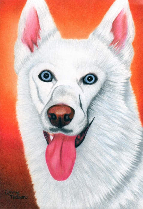
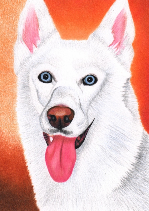
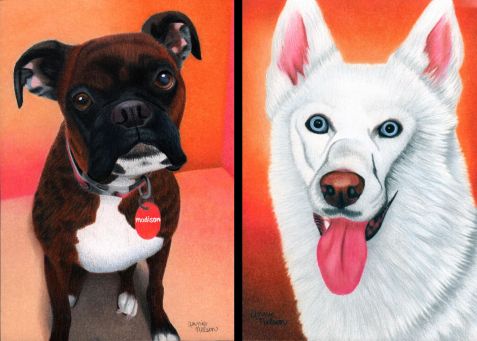
So, I was asked to draw these two dogs by a co-worker of a friend. Both of these are 5 x 7 inches in colored pencil. Madison took about 12.5 hours and Bandit took about 7.5 hours. As you can see below, Bandit is white! If you’ve read previous blogs, you will know that white dogs are kind of like a dreaded nemesis for me. They’re just really difficult to draw, but do go a little faster because there are fewer layers of color involved.
Madison wasn’t too difficult to draw. The only thing that made it a little tricky was that I was using a second photo to reference the colors because the lighting was better and she was younger in that photo.


Since these two drawings were for the same person, I wanted them to look like they “go together.” The photos I was working from definitely didn’t look like they match, so I decided to make sure the backgrounds coordinated really well. The colors I used on Madison’s background were fairly similar to the photo. The colors were orange-ish and the floor was white. I decided to make it a cream color and make the colors behind her a little more vibrant. I actually started the background on Bandit first, but I knew the plan I had mapped out for Madison already at that point.
I actually used two photos to do Bandit’s drawing too. The pose image didn’t have any detail, so I used a second photo to figure out where to add in some shading. I also had to fix the red-eye. Below I will post his drawing at a few different stages. I really struggled with how to finish off the white fur. Even though I don’t think it looks as good as the non-white dogs I’ve drawn, I definitely improved it from it’s original state.


And to finish it off, here are the two drawings side-by-side.

My blog will be winding down for a while when I start school up again and won’t be taking commissions, but I really don’t want to lose my art all together. I’ve drawn nearly 300 hours this year. Last year I was at a little over 200 hours and the year before that I think was only about 150 hours. You can visit my personal website here to see more!
Leave a Comment
October 13, 2015 at 8:34 pm (Animal Art, Art Website, Cat Art, Colored Pencil Project)
Tags: Annie Nelson Artist, Annie's Art, Annie's Art Blog, Cat art, cat drawing, colored pencil cat, custom pet portrait, personalized pet portrait
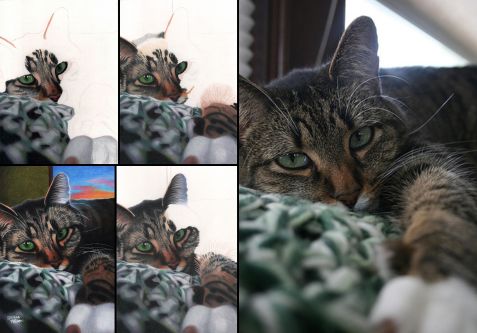
I finally got to draw a cat! Her name is Mabel. A friend asked me to draw her. It was a tough photo to work with because the front portion is out of focus, but I enjoyed working on everything except the paw/leg. It was really fun to draw the face!

Here’s the full size drawing… you can see I changed the background up a bit. I wanted to leave the window included because I liked how the light was shining on her fur. Since the drawing itself is only 5 x 7 inches, I don’t have much to say on the process of the drawing other than what I usually say, lots of layers! For her face, I put down some “beige,” then light black lines, then more beige, then finally more black.
I just remembered, I do have a comment about her whiskers. I used Gelly Rolls! At first the white lines were too thick, it looked goofy, but I realized if I use my black pencil I could scrape away about half the thickness of the line to thin them out and then I lightly colored directly on the base of the whiskers to make them look a little submerged into the fur. I am pretty happy with out it worked out.

I can’t remember if I wrote this in a previous post, but I decided to take down my Etsy page because I am going to be back in school and don’t want commissions during that time. You can still view my personal website here for a gallery though…
Leave a Comment
March 14, 2015 at 11:39 pm (Animal Art, Art Website, Colored Pencil Project, Dog Art)
Tags: Annie Nelson, Annie's Art, Annie's Art Blog, Artist Annie Nelson, colored pencil art, colored pencil dog, custom pet portrait, dog art, dog drawing, dog portrait, German Shepherd art, German Shepherd drawing, German Shepherd puppy, original art, original dog art, personalized pet portrait
Lacey and Bandit are two dogs that I drew for a girl I know over the summer. I had a lot of fun with these two drawings. Both of them provided me with a different challenge. Lacey is the German Shepherd. In the photo she was in a sandbox with some dirt on her nose. I thought it was absolutely adorable and didn’t want to crop it out, which meant I actually had to draw the sand.
Most of my backgrounds are more simplified. You can see the layers I used in the progression image below. I used a lot of purple and blue beneath the black on the fur with some grey to blend it all together and then for the sane I started with a flat layer of peach and added colors from there. I the next few layers of color in the sand I didn’t speckle, but I did use a circular motion to start to add in some texture. The final layers I really speckled, just like sand. It was mostly dark speckles on the lighter layers underneath, but I also put some lighter speckles on the darker areas. I really like how it came out and I think the colors all go well together.
This is also the second drawing that I did where I didn’t just use white dots as the light in the eye. I actually really tried to draw the shape I saw. I think that is all I have to say on this drawing. I will post Part 2 with Bandit and the side-by-side of the two drawings later. If you like my art, please check out my Etsy page or my personal website!

Leave a Comment
March 7, 2015 at 2:18 pm (Animal Art, Art Website, Colored Pencil Project, Dog Art)
Tags: Annie Nelson, Annie Nelson Artist, Annie's Art, Annie's Art Blog, art commissions, colored pencil dog, colored pencil lab, colored pencil labrador, custom pet portrait, dog art, dog drawing, labrador art, labrador drawing, labrador retriever drawing, original pet art, personalized pet portrait
This is Moosey. I have a soft spot in my heart for labs since I grew up with one. I did this for the same client as the previous drawing of the two poodle dogs last spring/summer sometime. There are a few things I really like about this drawing. First, this was the first drawing where I really tried to draw the eyes as I saw them on the photograph instead of with the two white dots and I am SO GLAD I did. I really like how they came out. They look rounded and like they are reflecting the light. I also really like the shadow on the ground. There is nothing extraordinary about it other than normally I draw a less defined shape for a shadow. Again I decided just to draw what I saw in the photo, except I made the background colors more fun than what the actual photo showed (cement.) There are some things I’m not crazy about, like the nose, but it is what it is. It’s not awful, I just don’t love it. This was only a 5 x 7 inch drawing. I think it took something like 15 hours give or take.
If you like my art you can check out a gallery either on my Etsy page or my personal website. 🙂

As a special side one, this is the one year adoptaversary of my own dog Lady. Happy birthday Lady girl. We love you! Adopt and save a life!
Leave a Comment
October 26, 2013 at 12:12 pm (Animal Art, Art Website, Colored Pencil Project, Dog Art)
Tags: Annie Nelson, Annie's Art, Annie's Art Blog, Artist Annie Nelson, colored pencil animal drawing, colored pencil dog, colored pencil golden retriever, colorful dog art, Commissioned dog art, custom dog drawing, custom pet portrait, custom portrait, dog art, dog art for sale, dog drawing, golden retriever art, golden retriever drawing, personalized dog art, personalized pet portrait, pet portrait, portrait art, vibrant dog art
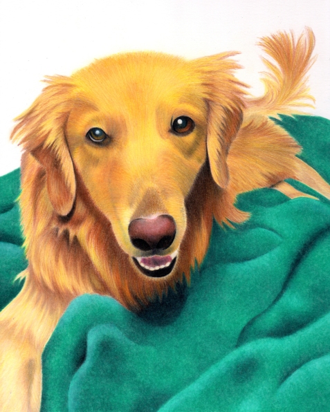
Here’s Duncan!

This is the completed version here. 🙂
And here is the comparison to the real photo. Obviously this is not photo-realism that I’m doing, but it is realistic in a way. I am pretty pleased with it overall.

I’m still looking for more commissioned work. Check out my Etsy site or my personal web page to see a more complete gallery of my work. 🙂
Thank you!
Leave a Comment


 Anyway, this the drawing I worked on after Daisy the Basset. He is Johnny the Chihuahua. This is from February-ish of 2016, so over a year ago. I am really happy with how he turned out. I wanted to use bright colors in the background and I think it fits really well with his coloring and also with gives it a fiesta kind of feel. I still remember him at the shelter. He was very shy, but was with a friend. I’m sure they are happy in the home they found.